 I have always liked color. As a kid, I enjoyed looking through the Land’s End catalogues, not particularly attracted by the clothing, but I liked the stacks of sweaters alongside the models, showing all the available colors.
My childhood may have been somewhat deprived, because for school I always got the box of 24 Crayons, rather than the majestic box of 64. Sixty-four! How could there be so many colors? (Now, sadly, I own many boxes of Crayons, starting at 64 and working up to double that — if you can imagine — and I almost never use any of them.)
My grandma bought me chalks and pastel oils (I’m sure it will surprise you to learn they are still in my desk), although I’m afraid I was never much of an artiste. The only thing I could ever think to “draw” was what I believe are called “sunbursts”: you color a jagged ribbon, and then on top of that another jagged ribbon, and so on . . . I may have to break out a few Crayons (is that a brand name? Crayola is, but do they own Crayon?) to illustrate. We’ll see how it goes.
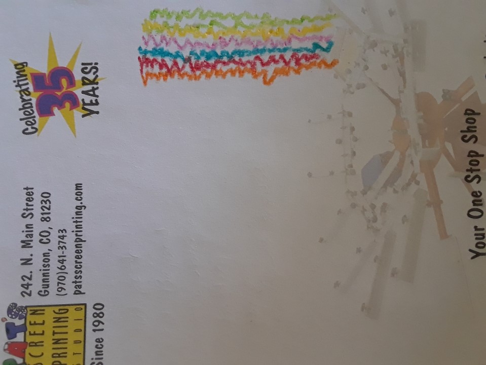 Here’s a very hasty example of a sunburst (and also a plug for Pat’s Screen Printing, Your One-Stop Shop). I used Crayons from my commemorative Star Wars box of 64.
So I gave up on the notion I never really had of a career as an artist, and operated in the realm of journalism: black and white and re(a)d all over.
Eventually I started, inadvertently, in the screen printing business, which comes with lots of colors. There are the shirt colors, and then there are the inks. This s a true story: the first job I ever printed was for Colorado Boomerangs, and it had five different screens, including two rainbow rolls (where two colors are placed on the same screen and blended organically, if you can use a word like “organic” around a plastic product) and specialty puff ink. I was given some rudimentary instruction and then left on my own. I must have managed, but it remains a nerve-racking memory.
In those early days of screen printing, I would lament at the large number of our customers who wanted white shirts with black ink. Now the preponderance of them want black shirts with white ink, but my favorite jobs are the ones — even if they just use black or white ink — where the shirts come in a variety of colors.
I prefer bold primary colors myself, which may not be a surprise to anyone who has been in Pat’s Screen Printing. We have a guy helping out with handy-man-type chores, and while he was doing some painting earlier this year, he decided the most shocking color one could find at Pat’s would be beige. Although it is SpongeBob’s self-professed favorite color. Patrick’s is aquamarine.
Which brings me to a job I often wonder about: who is it, at all these places that sell color, who names them? I especially wonder that in, say, a lipstick factory, where everything is some version of red. How many names could there be?
The rule at Pat’s Screen Printing is that whoever mixes a new color gets to name it. So we have “Aunt Franny’s Lipstick” (it’s more purple than red) and “Hi-Tek Spacefaring Cucumber” (green), “Radioactive Guacamole” (also green, ish), “Sickly Pig Pink” (which we usually present to customers just as “Pig Pink”), “Leslie Purple” (a color in honor of none other than Leslie Channell) and “Gallegos Red,” which ought to be pronounced “guy-eh-gos” but often is called “gal-e-gos” by new printers. That was a very early color, done for a family reunion (the Gallegos family, if that wasn’t apparent), but it’s been put to a lot of use over the years. It’s a 50-50 mix of our “Brite” (that’s how the company spells it) Red and Maroon.
A couple of years ago, t-shirt maker Gildan, which is our go-to shirt, came out with a color someone decided to call “Galapagos Blue.” Now, we live in a college town, but you should hear how people manage to mangle that. Some people, afraid they’ll bungle it, settle for pointing, like foreigners perusing a menu. Perhaps the color was inspired by a trip to the islands, but I’m still thinking Gildan should maybe have opted for something a bit less glamorous: Seawater Blue, or South Pacific Where the Turtles Live Blue.
These days Gildan is big on their “antiques,” which means they’ve threaded black through the color, or “heathers,” which are shot through with white. It cuts down on the need for creative names: Antique Royal and Heather Royal to bracket Regular Royal, rather than Antediluvian and Faded Fate, or some such.
When Dusty, our contractor, needed to turn in the application to our HOA for design and color approval (no more bright blue house with purple trim, I’m afraid, and it’s been too long since we painted, so I can’t tell you what clever paint names were assigned to these colors), he needed to know what shade of stucco we wanted. This is what I e-mailed back to him: “I’ll just say River Rock in Earthblend for the stone, and food colors for the Dryvit: pretzel, French toast, fudge.”
The Dryvit (which is the brand of stucco-like stuff that our house will be plastered with) comes in as many shades of brown as lipsticks come in red, and someone must have been hungry when assigned the task of naming all the shades.
We haven’t seen actual examples, which are apparently all the way away in Montrose, and I think we should look at them live rather than on the computer monitor (Dryvit specifically counsels against making a decision based on what you see on your monitor), but for the moment our house is scheduled to be plastered in French Toast. Not really, not like the witch’s gingerbread house, so don’t try to lick our siding, but won’t it be nice to be surrounded by breakfast?
And now I have spent two days regaling you with my thoughts on color. I imagine you’re anxious to hear more, but this is where I come to a conclusion on the matter. For now.
